
Established in 1861, AIME is the second largest and second longest running engineering society in the United States. Over the years the organization grew so large that four independently managed member societies developed based on their field of focus. AIME supports these societies in various ways.
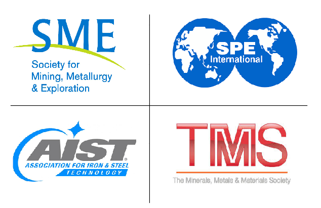
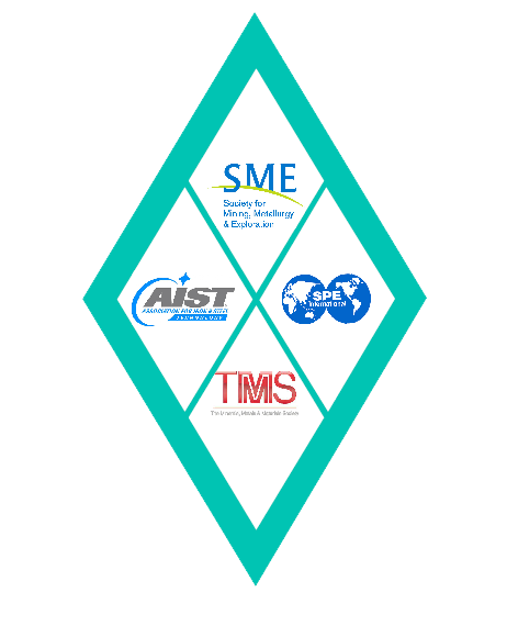
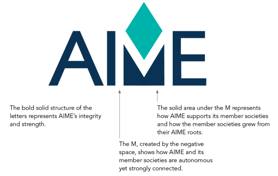
The task was to rebrand AIME for their upcoming 150th year anniversary that better aligns with the look and feel of other engineering societies. It also needed to convey it’s relationship to the four societies that grew out and are supported by AIME.
The parallelogram symbolizes the four member societies. Its dynamic shape suggests organization, structure,
and efficiency.
Like a compass needle, the diamond represents direction, vision, and forward thinking. With one point representing the future, the opposite point symbolizes the past, serving as a reminder that the experience and wisdom gained there, inform innovation.
Custom Patterns for use on totes, ties, socks and
other prints.


Web Design
Letter Head